.png?1774653999 "Re:HIRAKATA 大阪府枚方市のローカルメディア")
.png?1774653999 "Re:HIRAKATA 大阪府枚方市のローカルメディア")
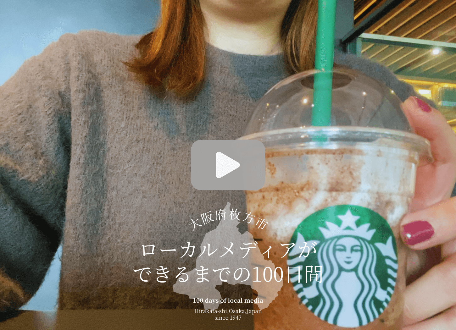
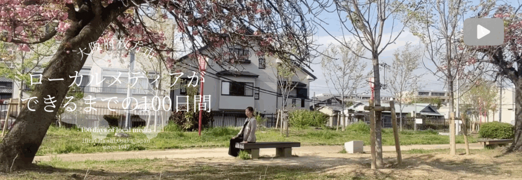
“100 Days in the Making of Local Media” is a short documentary program that follows the creation of “Re:HIRAKATA,” a local media outlet that conveys the charm of Hirakata City, Osaka Prefecture, including its people, nature, and spots, with the concept of “A slightly more careful lifestyle possible in Hirakata.”

On the first day, we spoke to Hori Hiromi (hereinafter referred to as Hori), a native of Hirakata City, former public relations officer at Hirakata Park, and representative of Social Business Development ACTION, which runs “Re:HIRAKATA,” about what inspired her to create a local media outlet and her feelings about her hometown.
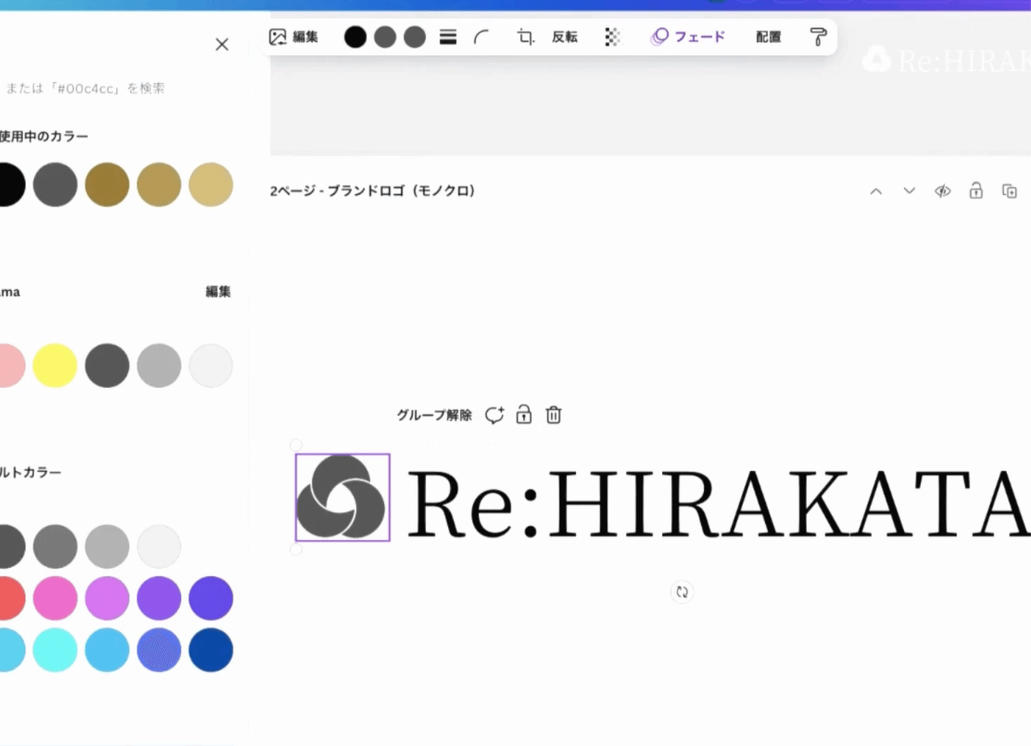
So, on the second day, we will introduce the thoughts behind the name “Re:HIRAKATA” and how to create a brand logo using Canva Pro.
As a DTP specialist, Hori will show you some tips for logo design, the Canva Pro interface, and an actual planning notebook.
- “Re:HIRAKATA” – A name that expresses feelings for the hometown
- A logo is the face of a brand. It creates identity, recognition, and differentiation.
- The Re:HIRAKATA brand logo is made up of three intertwined circles.
- A brand logo born with the joy of starting local media
- Continue watching on YouTube
- Back Number
“Re:HIRAKATA” – A name that expresses feelings for the hometown
Hori returned to her hometown of Hirakata for the first time in 10 years, and as the places and shops that were special to her had changed or disappeared, she decided to create a local media outlet with the desire to “preserve these memories somehow.”
The first thing she did was decide on a name for the local media.
Hori:
“Having a name makes me feel more attached to it, and by putting into words the vague image in my head of what concept I want to achieve, I can see the direction. That’s why I decided on the name first.”
Hori says the name for the local media was decided smoothly.
Hori:
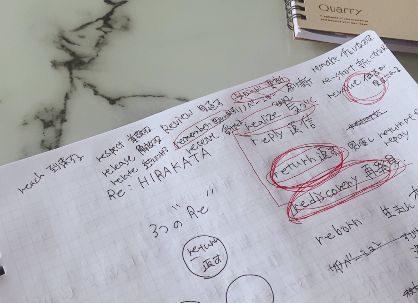
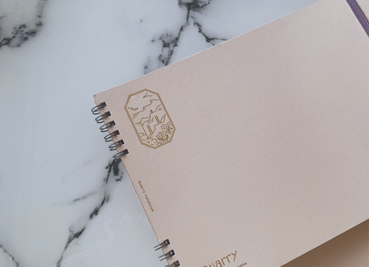
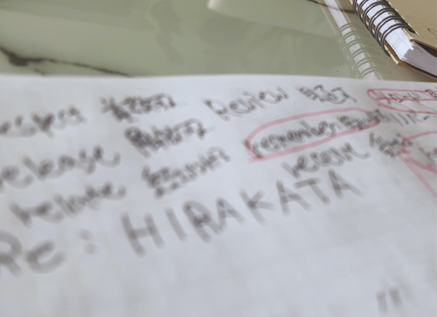
“I always write out my ideas in a notebook called Quarry, and I wrote the names of Re:HIRAKATA and the local media at the very beginning.”
So, what does Re:HIRAKATA mean?
Hori:
“When you reply to an email, the subject line starts with ‘Re:’, right? That’s what I’m thinking of. The reason is that I grew up in my hometown of Hirakata, and I’ve received many benefits from the city.
I wanted to give back to my hometown, Hirakata City, so I gave it the title “Re:” as if I was sending a love letter in response to that kindness.”
A logo is the face of a brand. It creates identity, recognition, and differentiation.
A brand logo is a symbolic design of a product or service name. It plays an important role in forming the brand’s image by expressing its identity, improving recognition, and differentiating it from other brands.
In the case of local media, the brand logo is the name turned into a logo.
Hori:
“The human brain processes visual information much faster than textual information. For example, visual information such as photos and videos is processed several times faster by the brain. For this reason, the shape and color of the logo and other design elements have a greater impact than simply writing the name (of a local media outlet) in text.”
So, what should you pay attention to when creating a logo?
Hori:
“The first thing I want to talk about is Japanese fonts. Japanese fonts can be broadly divided into Ming and Gothic. The choice of font will depend on the concept of the local media you are creating.”
Hori:
“Next is color. This also needs to be chosen to match the concept of the local media.
Ordinary people may not think that colors have any effect. In fact, color psychology has determined that if you use a certain color, you can convey a certain feeling to the viewer.
Therefore, it is better to utilize the effects of color as well.”
The Re:HIRAKATA brand logo is made up of three intertwined circles.

Hori:
“The keyword ‘three Re’ was there in the proposal stage. That’s why I wanted to use three circles in the brand logo.
However, even if I arrange three circles in a triangle, there is still a colon (:) after “Re”, so there are too many circles.
Therefore, we decided to use three circles in the brand logo that have a unique design, with each circle intertwining to form one shape.”

A brand logo born with the joy of starting local media
Hori:
“When I placed the completed brand logo in the upper right corner of the video, I thought, ‘Wow, that’s amazing!’ (laughs)
I’m embarrassed to brag about it, but I feel like I’ve made something happen. It’s a very small, really small step, but it really gave me a sense that local media is starting to take off, and I was really happy.”
Hori says that in the future, just by looking at this brand logo, it will become a common language that people will say, “That’s Re:HIRAKATA, right?”
Hori’s challenge continues, hoping to get the Re:HIRAKATA logo out to as many people as possible who love Hirakata and want to make Hirakata a better place.
In the video, Hori shows you how to use Canva Pro. She also talks about how to use our brand logo. Please take a look.
Continue watching on YouTube
Back Number
If you subscribe to our YouTube channel, you will be notified of the latest episodes.
Please also enjoy back issues such as the playlists “emotional” and “WORLD,” the essay “That Day, That Time in Hirakata,” and the recipe “French Home Cooking Taught by Madame.”
Photo by Hiromi Hori